Code
ggplot(mpg, aes(x = hwy, y = cty, color = cyl)) +
geom_point(alpha = 0.5, size = 2) +
scale_color_viridis_c() +
theme_minimal()
This is a test of quarto
Recreating examples from the quarto website
Alex Bresler
May 20, 2022
This is the code from the penguins tutorial
This is a super basic intro.
Note that there are five types of callouts, including: note, tip, warning, caution, and important.
This is an example of a callout with a caption.
BAP Out
Quarto enables you to weave together content and executable code into a finished document. To learn more about Quarto see https://quarto.org.

The penguins data from the palmerpenguins package contains size measurements for 344 penguins from three species observed on three islands in the Palmer Archipelago, Antarctica.
The plot below shows the relationship between flipper and bill lengths of these penguins.
ggplot(penguins,
       aes(x = flipper_length_mm, y = bill_length_mm)) +
  geom_point(aes(color = species, shape = species)) +
  scale_color_manual(values = c("darkorange","purple","cyan4")) +
  labs(
    title = "Flipper and bill length",
    subtitle = "Dimensions for penguins at Palmer Station LTER",
    x = "Flipper length (mm)", y = "Bill length (mm)",
    color = "Penguin species", shape = "Penguin species"
  ) +
  theme_minimal()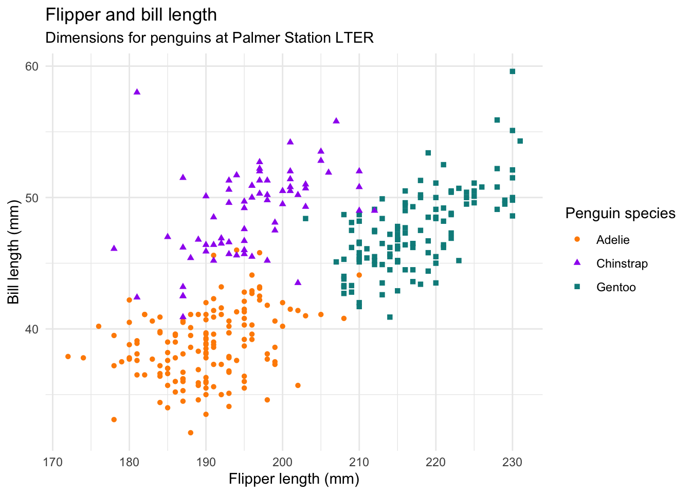
This is the code from the computations
This dataset contains a subset of the fuel economy data from the EPA. Specifically, we use the mpg dataset from the ggplot2 package.
The visualization below shows a positive, strong, and linear relationship between the city and highway mileage of these cars. Additionally, mileage is higher for cars with fewer cylinders.
ggplot(mpg, aes(x = hwy, y = cty, color = cyl)) +
  geom_point(alpha = 0.5, size = 2) +
  scale_color_viridis_c() +
  theme_minimal()
There are 234 observations in our data.
The average city mileage of the cars in our data is 16.86 and the average highway mileage is 23.44.
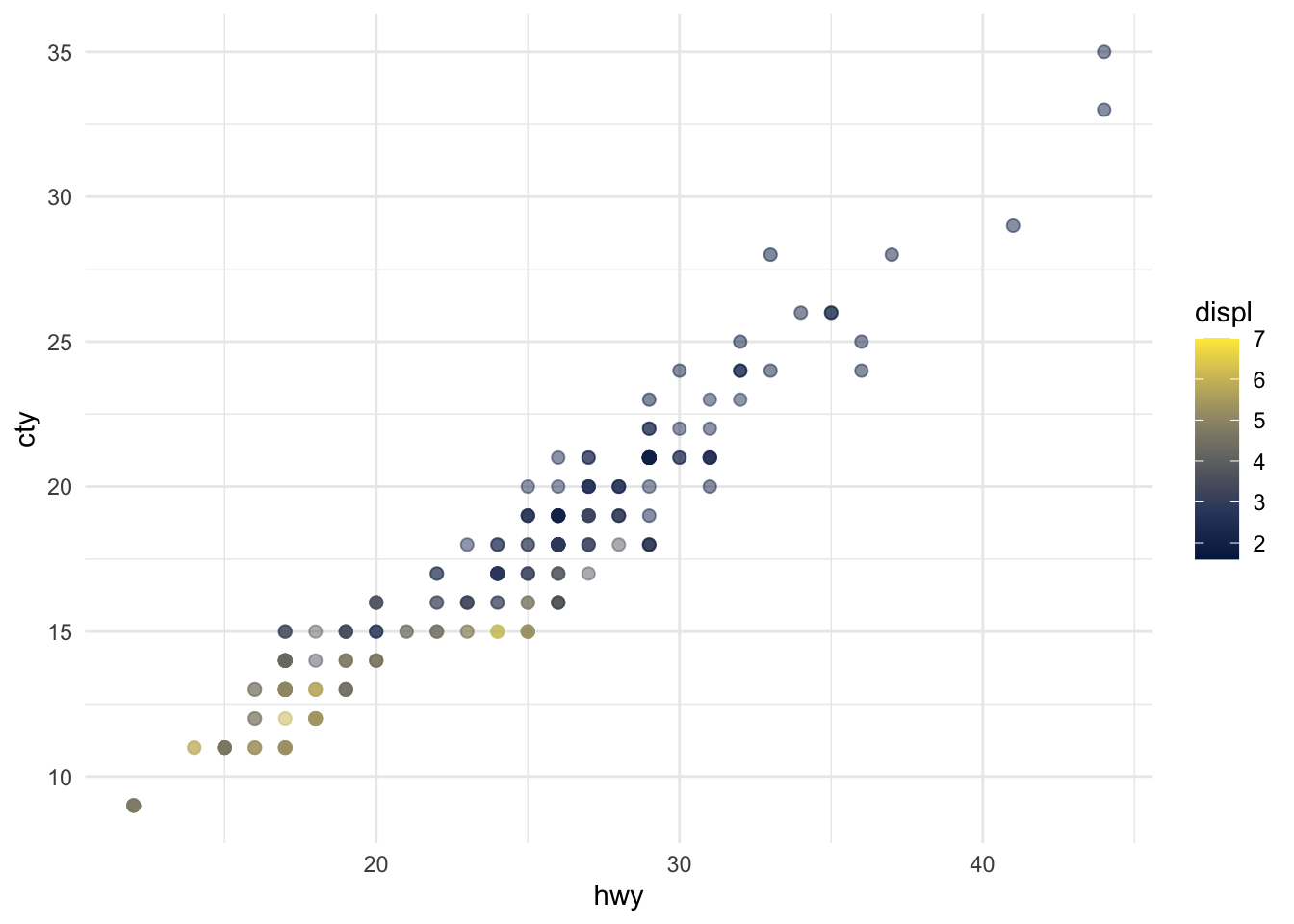
The plots in Figure Figure 1 show the relationship between city and highway mileage for 38 popular models of cars. In Figure Figure 1 (a) the points are colored by the number of cylinders while in Figure Figure 1 (b) the points are colored by engine displacement.
ggplot(mpg, aes(x = hwy, y = cty, color = cyl)) +
  geom_point(alpha = 0.5, size = 2) +
  scale_color_viridis_c() +
  theme_minimal()

ggplot(mpg, aes(x = hwy, y = cty, color = displ)) +
  geom_point(alpha = 0.5, size = 2) +
  scale_color_viridis_c(option = "E") +
  theme_minimal()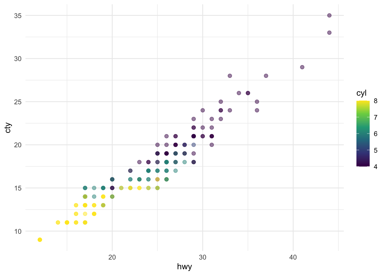
In this analysis, Authoring using housing prices, we build a model predicting sale prices of houses based on data on houses that were sold in the Duke Forest neighborhood of Durham, NC around November 2020. Let’s start by loading the packages we’ll use for the analysis.
We present the results of exploratory data analysis in Section 3.2 and the regression model in Section 3.3.
We’re going to do this analysis using literate programming [@knuth1984].
The data contains 98 houses. As part of the exploratory analysis let’s visualize and summarize the relationship between areas and prices of these houses.
Figure 2 shows two histograms displaying the distributions of price and area individually.
ggplot(duke_forest, aes(x = price)) +
geom_histogram(binwidth = 50000) +
labs(title = "Histogram of prices")
ggplot(duke_forest, aes(x = area)) +
geom_histogram(binwidth = 250) +
labs(title = "Histogram of areas")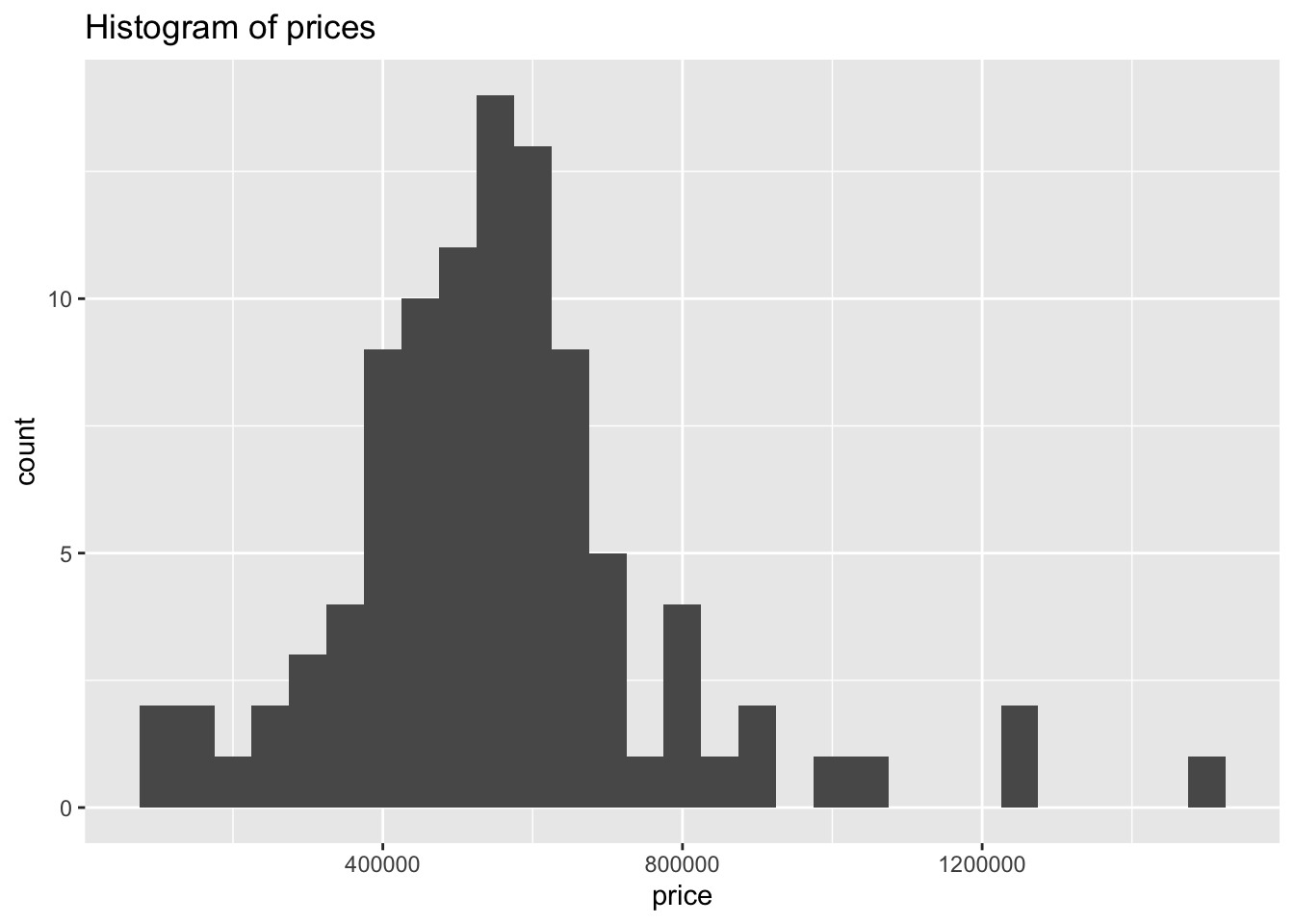
prices
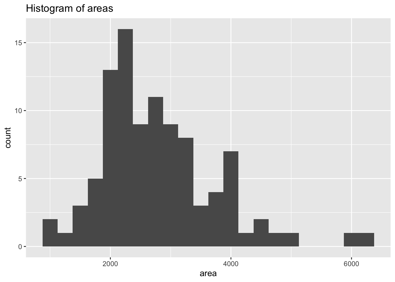
areas
Figure 3 displays the relationship between these two variables in a scatterplot.
ggplot(duke_forest, aes(x = area, y = price)) +
geom_point() +
labs(title = "Price and area of houses in Duke Forest")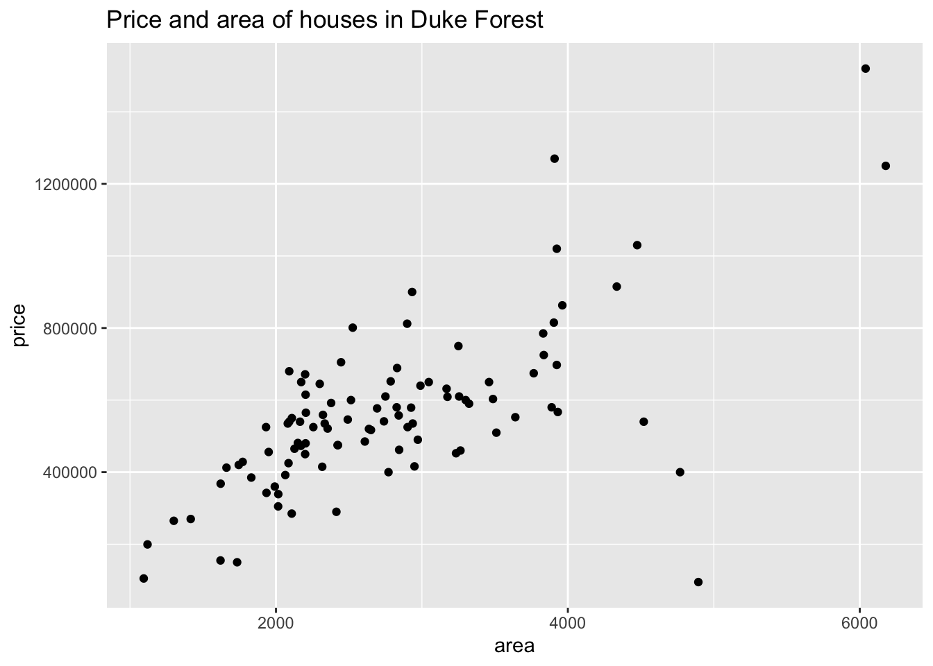
Table 1 displays basic summary statistics for these two variables.
| Median price | IQR price | Median area | IQR area | Correlation, r |
|---|---|---|---|---|
| 540000 | 193125 | 2623 | 1121 | 0.67 |
We can fit a simple linear regression model of the form shown in Equation 1.
price = \hat{\beta}_0 + \hat{\beta}_1 \times area + \epsilon \tag{1}
Table 2 shows the regression output for this model.
| term | estimate | std.error | statistic | p.value |
|---|---|---|---|---|
| (Intercept) | 116652 | 53302.46 | 2.19 | 0.03 |
| area | 159 | 18.17 | 8.78 | 0.00 |
This is a pretty incomplete analysis, but hopefully the document provides a good overview of some of the authoring features of Quarto!
@online{bresler2022,
author = {Bresler, Alex and Bresler, Alex},
title = {Quarto {Tutorials}},
date = {2022-05-20},
url = {https://basedmusings.com/posts/2022-05-20-qmd-get-started/},
langid = {en}
}
---
title: "Quarto Tutorials"
subtitle: "This is a test of quarto"
description: |
Recreating examples from the quarto website
author: "Alex Bresler"
image: "https://quarto.org/docs/get-started/hello/images/rstudio-source-visual.png"
date: "2022-05-20"
touch: true
toc: true
title-block-banner: false
highlight-style: pygments
html-math-method: katex
fig-align: center
format:
html:
theme: litera
anchor-sections: true
code-fold: true
code-copy: hover
code-tools: true
code-link: true
editor: source
execute:
warning: false
freeze: true
---
# Part I: Penguins
This is the code from the `penguins` tutorial
::: callout-note
This is a super basic intro.
:::
::: callout-note
Note that there are five types of callouts, including: `note`, `tip`, `warning`, `caution`, and `important`.
:::
::: callout-tip
## Tip With Caption
This is an example of a callout with a caption.
:::
::: callout-important
## EMERGENCY, **AWFL** ON THE LOOSE, WRECKING AMERKWA
> BAP Out
:::
```{r}
#| label: load-packages
#| include: false
library(tidyverse)
library(palmerpenguins)
```
## Meet Quarto {#sec-meet-quarto}
Quarto enables you to weave together content and executable code into a finished document. To learn more about Quarto see <https://quarto.org>.
## Meet the penguins
{style="float:right;" fig-alt="Illustration of three species of Palmer Archipelago penguins: Chinstrap, Gentoo, and Adelie. Artwork by @allison_horst." width="401"}
The `penguins` data from the [**palmerpenguins**](https://allisonhorst.github.io/palmerpenguins "palmerpenguins R package") package contains size measurements for `r nrow(penguins)` penguins from three species observed on three islands in the Palmer Archipelago, Antarctica.
The plot below shows the relationship between flipper and bill lengths of these penguins.
```{r}
#| label: plot-penguins
#| warning: false
#| echo: true
#| fig-cap: "A basic scatter plot of flipper length versus bill length"
#| fig-cap-location: bottom
ggplot(penguins,
aes(x = flipper_length_mm, y = bill_length_mm)) +
geom_point(aes(color = species, shape = species)) +
scale_color_manual(values = c("darkorange","purple","cyan4")) +
labs(
title = "Flipper and bill length",
subtitle = "Dimensions for penguins at Palmer Station LTER",
x = "Flipper length (mm)", y = "Bill length (mm)",
color = "Penguin species", shape = "Penguin species"
) +
theme_minimal()
```
# Part II: Computations
This is the code from the computations
This dataset contains a subset of the fuel economy data from the EPA. Specifically, we use the `mpg` dataset from the **ggplot2** package.
```{r}
#| label: load-packages-computations
#| echo: false
library(ggplot2)
```
The visualization below shows a positive, strong, and linear relationship between the city and highway mileage of these cars. Additionally, mileage is higher for cars with fewer cylinders.
```{r}
#| label: scatterplot-mpg
ggplot(mpg, aes(x = hwy, y = cty, color = cyl)) +
geom_point(alpha = 0.5, size = 2) +
scale_color_viridis_c() +
theme_minimal()
```
There are `r nrow(mpg)` observations in our data.
```{r}
#| echo: false
mean_cty <- round(mean(mpg$cty), 2)
mean_hwy <- round(mean(mpg$hwy), 2)
```
The average city mileage of the cars in our data is `r mean_cty` and the average highway mileage is `r mean_hwy`.
The plots in Figure @fig-mpg show the relationship between city and highway mileage for 38 popular models of cars. In Figure @fig-mpg-1 the points are colored by the number of cylinders while in Figure @fig-mpg-2 the points are colored by engine displacement.
```{r}
#| label: fig-mpg
#| fig-cap: "City and highway mileage for 38 popular models of cars."
#| fig-subcap:
#| - "Color by number of cylinders"
#| - "Color by engine displacement, in liters"
#| layout-ncol: 2
#| column: page
#| cache: true
ggplot(mpg, aes(x = hwy, y = cty, color = cyl)) +
geom_point(alpha = 0.5, size = 2) +
scale_color_viridis_c() +
theme_minimal()
ggplot(mpg, aes(x = hwy, y = cty, color = displ)) +
geom_point(alpha = 0.5, size = 2) +
scale_color_viridis_c(option = "E") +
theme_minimal()
```
# Part III: Authoring
## Introduction
In this analysis, <a href="https://quarto.org/docs/get-started/authoring/rstudio.html" target="_blank">Authoring using housing prices</a>, we build a model predicting sale prices of houses based on data on houses that were sold in the Duke Forest neighborhood of Durham, NC around November 2020. Let's start by loading the packages we'll use for the analysis.
```{r}
#| label: load-pkgs
#| code-summary: "Packages"
#| message: false
library(openintro)  # for data
library(tidyverse)  # for data wrangling and visualization
library(knitr)      # for tables
library(broom)      # for model summary
```
We present the results of exploratory data analysis in @sec-eda and the regression model in @sec-model.
We're going to do this analysis using literate programming [@knuth1984].
## Exploratory data analysis {#sec-eda}
The data contains `r nrow(duke_forest)` houses. As part of the exploratory analysis let's visualize and summarize the relationship between areas and prices of these houses.
### Data visualization
@fig-histogram shows two histograms displaying the distributions of `price` and `area` individually.
```{r}
#| label: fig-histogram
#| fig-cap: "Histograms of individual variables"
#| fig-subcap:
#| - "Histogram of `price`s"
#| - "Histogram of `area`s"
#| layout-ncol: 2
#| column: page-right
ggplot(duke_forest, aes(x = price)) +
  geom_histogram(binwidth = 50000) +
  labs(title = "Histogram of prices")

ggplot(duke_forest, aes(x = area)) +
  geom_histogram(binwidth = 250) +
  labs(title = "Histogram of areas")
```
@fig-scatterplot displays the relationship between these two variables in a scatterplot.
```{r}
#| label: fig-scatterplot
#| fig-cap: "Scatterplot of price vs. area of houses in Duke Forest"
ggplot(duke_forest, aes(x = area, y = price)) +
  geom_point() +
  labs(title = "Price and area of houses in Duke Forest")
```
### Summary statistics
@tbl-stats displays basic summary statistics for these two variables.
```{r}
#| label: tbl-stats
#| tbl-cap: "Summary statistics for price and area of houses in Duke Forest"
duke_forest %>%
  summarise(
    `Median price` = median(price),
    `IQR price` = IQR(price),
    `Median area` = median(area),
    `IQR area` = IQR(area),
    `Correlation, r` = cor(price, area)
    ) %>%
  kable(digits = c(0, 0, 0, 0, 2))
```
## Modeling {#sec-model}
We can fit a simple linear regression model of the form shown in @eq-slr.
$$
price = \hat{\beta}_0 + \hat{\beta}_1 \times area + \epsilon
$$ {#eq-slr}
@tbl-lm shows the regression output for this model.
```{r}
#| label: tbl-lm
#| tbl-cap: "Linear regression model for predicting price from area"
price_fit <- lm(price ~ area, data = duke_forest)

price_fit %>%
  tidy() %>%
  kable(digits = c(0, 0, 2, 2, 2))
```
::: callout-note
This is a pretty incomplete analysis, but hopefully the document provides a good overview of some of the authoring features of Quarto!
:::
## References {.unnumbered}